Final Work
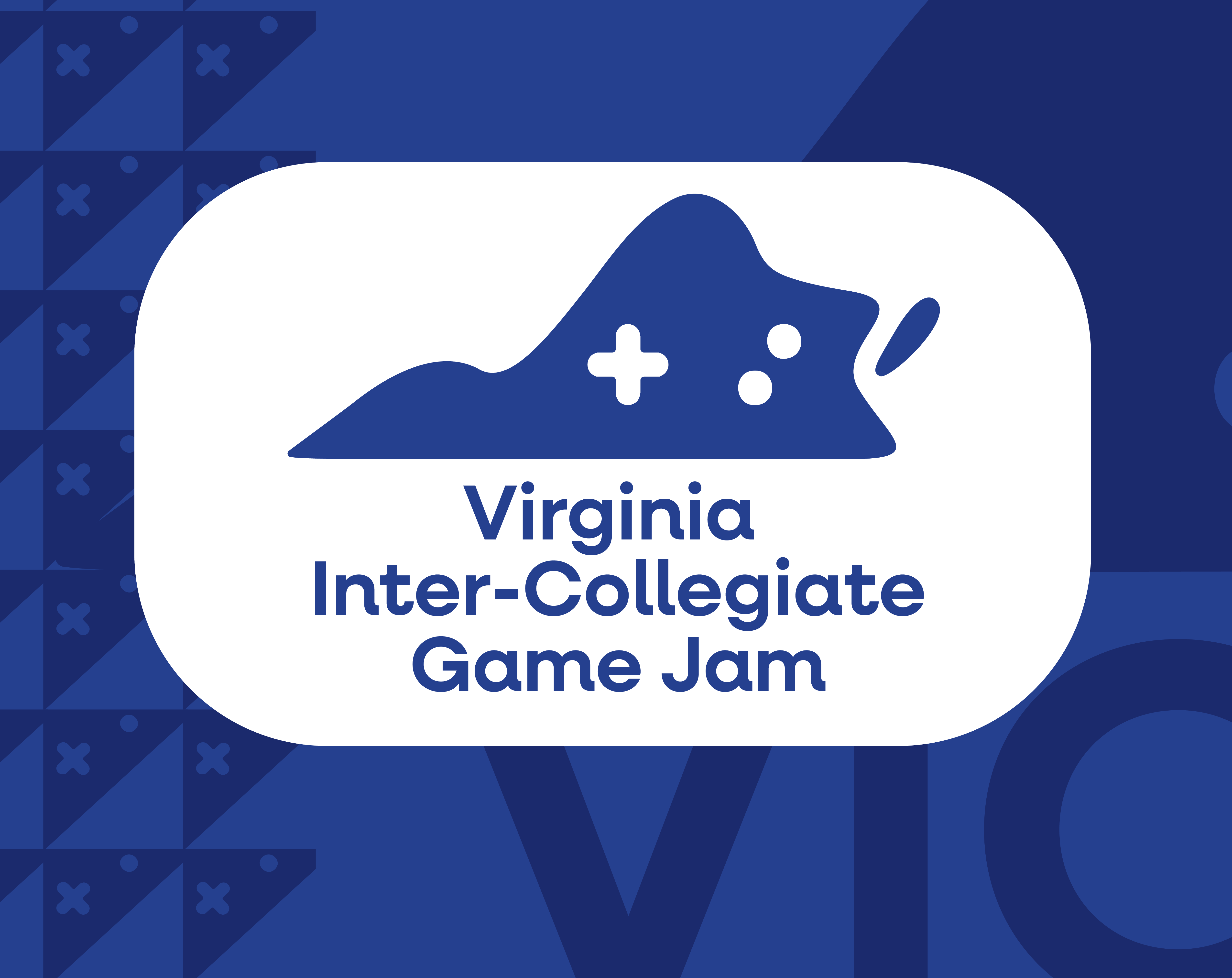
Thumbnail for event
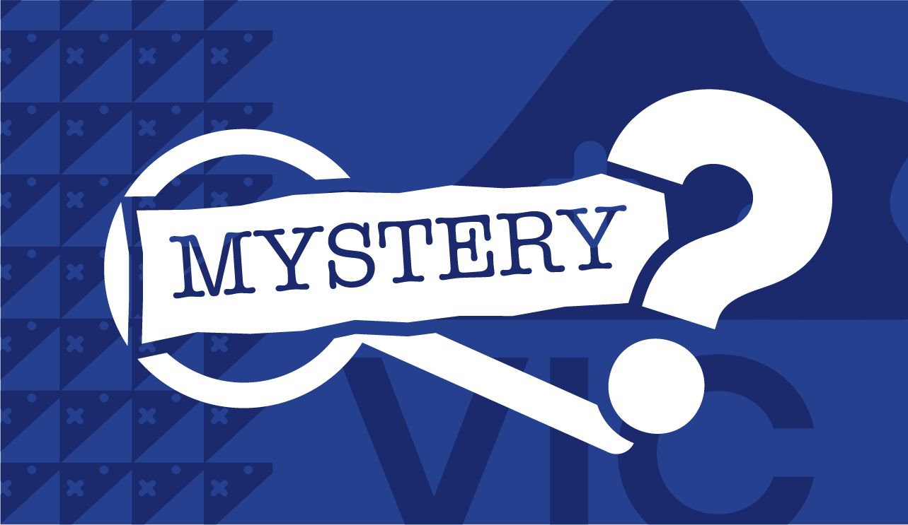
Theme announcement graphic
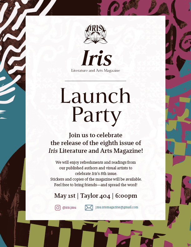
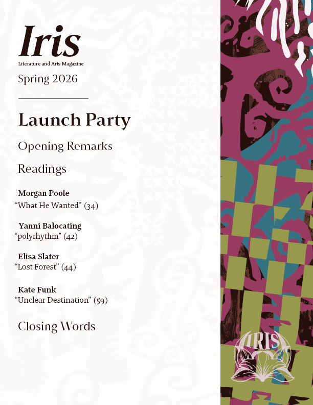
Deliverables for launch party (flyer for print and social media, handbill schedule for launch party)
Brand Identity | Motion Graphics | Video Editing | Adobe Suite | Collaboration
I created a complete identity for VIC, a nonprofit that hosts a yearly game jam. This included a brand identity, a website, a sponsorship deck, motion graphics, and more.
Thumbnail for event
Theme announcement graphic
Deliverables for launch party (flyer for print and social media, handbill schedule for launch party)
1. The Client
I created branding for VIC, an organization created
by game development clubs across 6 different universities in
Virginia.
2. The Problem
VIC was a completely new
organization with no identity. Initially, there was not going to be
any branding whatsoever, but I was brought into the project to pitch
ideas. We also had an incredibly short turnaround time (about 2-3
weeks) to create everything.
The questions I was asking
myself while designing were:
What should the event feel like?
What
do I like about video games and game jams that I can bring into my
work?
What are my demographics, and how does that impact what
needs to be communicated?
3. The Process
What’s Important
My
work had three main concepts that needed to be communicated:
The
event is a game jam
The event takes place in Virginia
The
event is for college students
What I love about game
jams
I began to think about what I love about jams, and what
specifically was so exciting about this opportunity.
You get to
collaborate with people to create something awesome
You can
experience and connect with game developers at other universities
This
event brings an appreciation of creativity to schools where that may
not be as valued. In general, I felt really seen and accepted by my
peers in game development, and wanted to bring that joy.
If
I had to sum up what I was aiming for, I wanted VIC to feel like a
utopia that values creativity and friendship. It takes inspiration
from video games of the late 2000’s, where connecting to the internet
was a new and exciting thing. I wanted to bring that same optimism to
students who had a network through this event.
Adjectives
Professional
Optimistic
Friendly
Technological
Based
on all of this, I began by trying to find a logo and word mark that
made sense.
We narrowed it down to these two, and landed on
the following selection
(show final piece, and explain reasoning
behind type/colors)
4. My Solutions
The most important
part of Iris is the student-submitted work,
so incorporating student artwork as a motif through the magazine
creates a more personal touch and keeps the focus on the artwork. The
vectorization creates a more graphical and abstract approach
To
make sure that my team didn’t struggle, I provided an InDesign
template with the fonts and swatches already added, as well as a few
images they could use as background texture.
5. The
Results
(show mockups)
6. What I learned
