After 3 semesters on the design team of
Iris, I became the lead designer in Fall of
2025.
The Client
I designed magazine branding
for Iris, a biannual literature and arts
magazine publishing student prose, poetry, and artwork at James
Madison University.
The Problem
Each issue of
Iris adopts a new color palette and
typographic look to match the tone of its submissions. Additionally,
the design scheme needed to be simple enough that my team of junior
designers could utilize it without much trouble.
So, the
questions I was asking myself while designing were:
How can I capture the spirit of Iris
through graphic design?
How can I create
a design that’s unique and memorable, while still taking a backseat to
the contents of the magazine?
Can my junior designers easily pick
up this style to ensure a cohesive magazine?
The Process
Picking
a Direction
My work began by analyzing the submissions with the
editorial team. We discussed overarching themes, and compiled all the
artwork into one space in order to search for colors, craft
techniques, and graphic appeal.
Nature Ocean, Whispering
woods/green
Familial/friendship
Friends dying
Loss
solitary
Angst
Coming
of age, loss of innocence
Adjectives
Mature
Tactile
Artistic
Natural
Based
on that information, I created a few options for the editorial team to
pick from:
(show options)
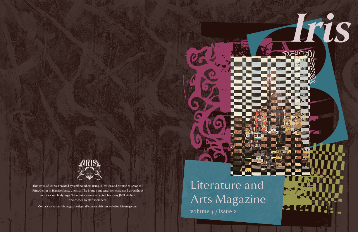
We narrowed it down to these
two, and landed on the following selection
(show final piece, and
explain reasoning behind type/colors)
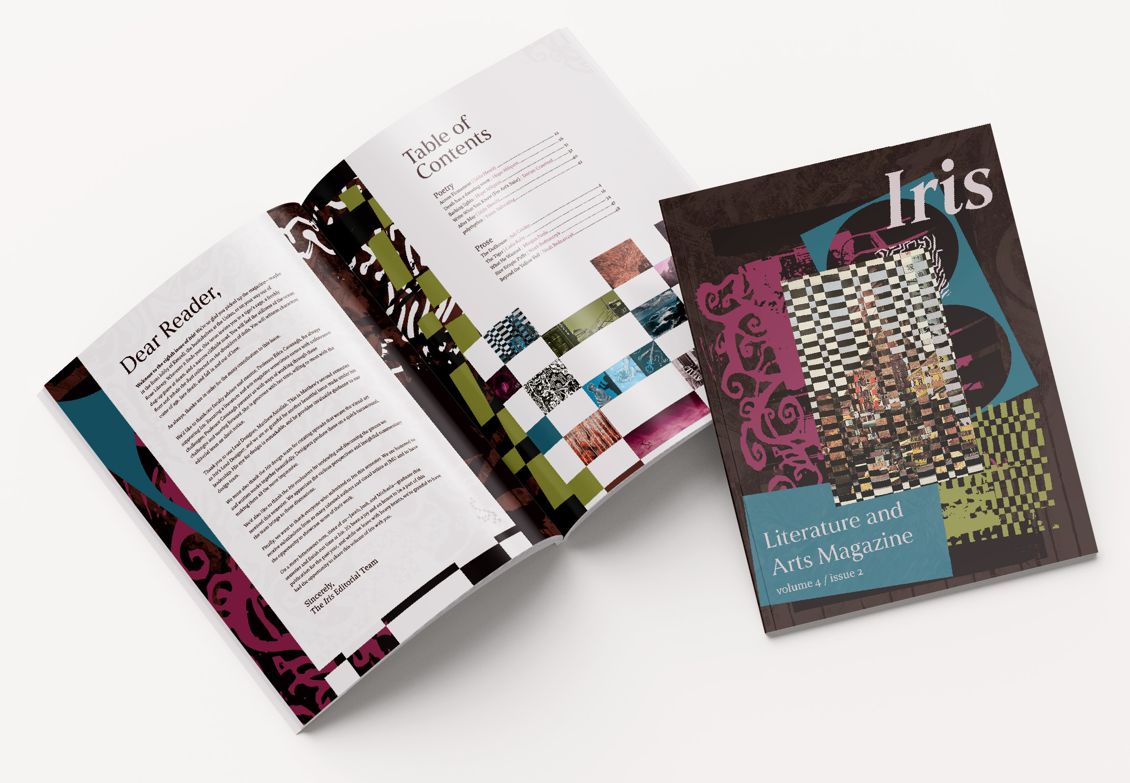
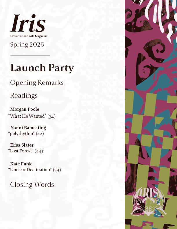
My Solutions
The
most important part of Iris is the
student-submitted work, so incorporating student artwork as a motif
through the magazine creates a more personal touch and keeps the focus
on the artwork.
To make sure that my team didn’t struggle,
I provided an InDesign template with the fonts and swatches already
added, as well as a few images they could use as background
texture.